6 Correlation and Association
As Gregory House once said, “The cave man who heard a rustle in the bushes checked out to see what it was lived longer than the guy who assumed it was just a breeze”. House’s point here is that the human ability for hypothetical reasoning and the ability to form associations in our minds was critical to our survival and development. In this case of course, we learned to check the bush since it could be a sabretooth or another human who wanted to eat us or steal our food, and we also learned to reason that checking things out, spear in hand, was more likely to keep us safe than rolling the dice by not checking. We will discuss the aspect of statistical reasoning that covers hypothetical reasoning later, but for now we cover simple correlation and measures of association. In statistical analysis, we typically begin by looking at bivariate correlations. We calculate a statistic called “Pearson’s \(r\)”. The formula for Pearson’s \(r\), the Pearson correlation coefficient for continuous variables, is: \[ r = \frac{\sum_{i=1}^{N} (x_i - \bar{x})(y_i - \bar{y})}{\sqrt{\sum_{i=1}^{N} (x_i - \bar{x})^2} \sqrt{\sum_{i=1}^{N} (y_i - \bar{y})^2}}. \] Let’s parse these terms, shall we? The numerator is the formula for what we call the covariance between two random variables. It is the sum of the differences between the individual datapoints for each variable and its average, divided by the product of the standard deviations of each variable. More practically, \(r\) represents how variables tend to move together, given how much their values move internally (hence the standard deviation term). As a quick example, let’s compute the Pearson correlation coefficient \(r\) for the following data points \(x= \{1, 2, 3, 4\}\) and for \(y\) we have \(y = \{2, 4, 5, 7\}.\)
Here is the computation…
First we calculate the means of \(x\) and \(y\): \[ \begin{aligned} &\bar{x} = \frac{1 + 2 + 3 + 4}{4} = 2.5 & \bar{y} = \frac{2 + 4 + 5 + 7}{4} = 4.5 \end{aligned} \] Then compute the differences from the mean for each data point: \[ \begin{aligned} & x_i - \bar{x} = \{-1.5, -0.5, 0.5, 1.5\} & y_i - \bar{y} = \{-2.5, -0.5, 0.5, 2.5\}. \end{aligned} \] Then calculate the sum of the products of these differences: \[ \begin{aligned} &\sum (x_i - \bar{x})(y_i - \bar{y}) = \\ &(-1.5 \cdot -2.5) + (-0.5 \cdot -0.5) + (0.5 \cdot 0.5) + (1.5 \cdot 2.5) = \\ &3.75 + 0.25 + 0.25 + 3.75 = 8. \end{aligned} \]
Next, we compute the sum of the squared differences for \(x\) and \(y\). For \(x\) we have \[ \begin{aligned} &\sum (x_i - \bar{x})^2 = \\ &(-1.5)^2 + (-0.5)^2 + (0.5)^2 + (1.5)^2 = \\ & 2.25 + 0.25 + 0.25 + 2.25 = 5. \end{aligned} \] For \(y\) we have \[ \begin{aligned} &\sum (y_i - \bar{y})^2 = \\ &(-2.5)^2 + (-0.5)^2 + 0.5^2 + 2.5^2 = \\ &6.25 + 0.25 + 0.25 + 6.25 = 13. \end{aligned} \]
Now, we plug these in: \[ r = \frac{\sum (x_i - \bar{x})(y_i - \bar{y})}{\sqrt{\sum (x_i - \bar{x})^2} \sqrt{\sum (y_i - \bar{y})^2}} = \frac{8}{\sqrt{5} \cdot \sqrt{13}} = \frac{8}{\sqrt{65}} = \frac{8}{8.062} \approx \boxed{0.993}. \]
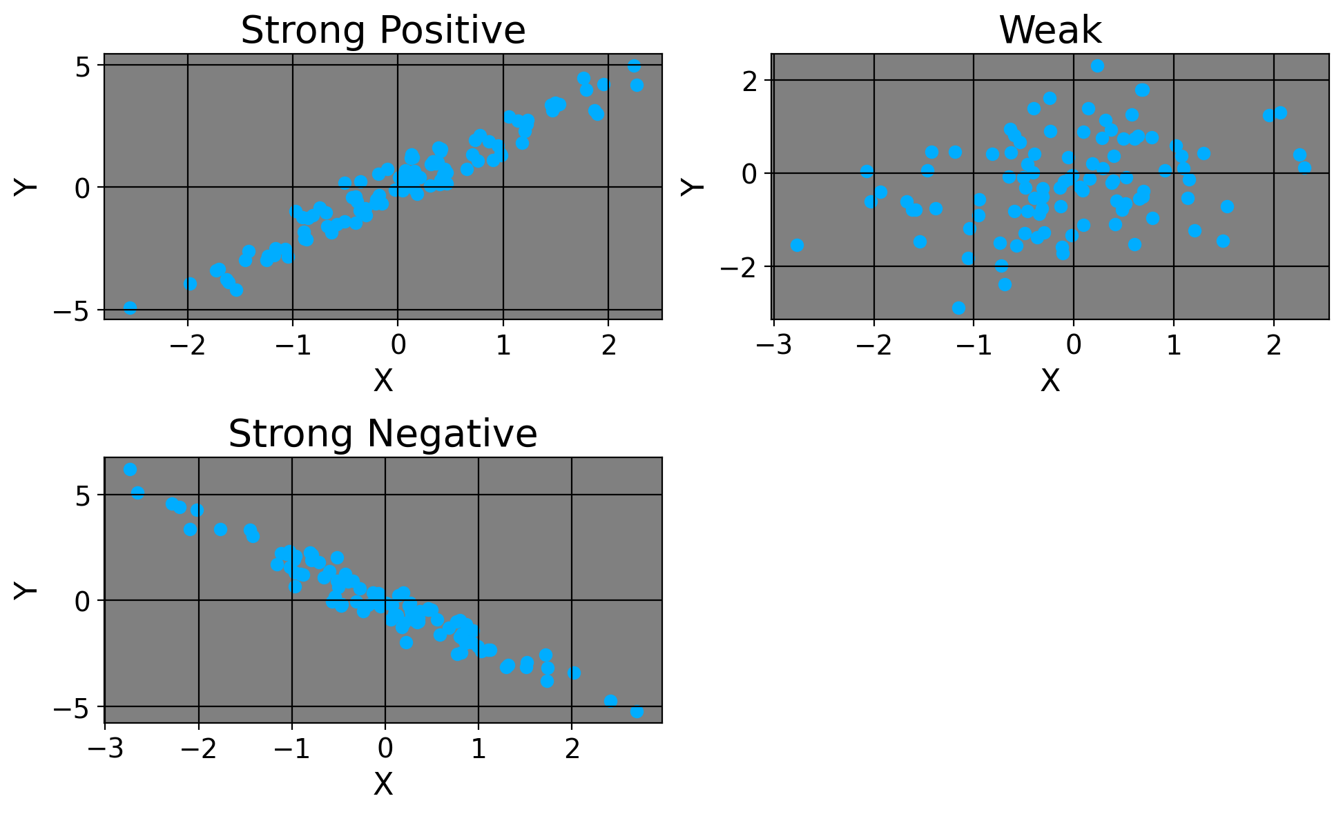
Okay, so our correlation coefficient is 0.993. We’d say there’s a strong, positive linear relationship between our variables here (whatever they happen to be). Similarly, if \(r\) were negative, we’d say there’s a strong negative relation. Of course, if the coefficient were, say, 0.01 or -0.01, we’d say there’s pretty much no relationship between the variables.
Here’s how we’d visualize these.
We can think of \(r\) as the degree to which one variable moves with another variable. If the relationship were just \(r=1\) or \(r=-1\), we’d say for every one increase in \(x\), there’s a guaranteed increase/decrease in \(y\) respectively because they move identically. For a simple example of a perfect linear relation, consider a dataset with the number of games an NBA team won in one column versus how many they lost in another column. For simplicitly, let’s consider the first ten games. If a team won 5, they also lost 5. If a team won 6, they must’ve lost 4. There’s a perfect, inverse linear relaionship between these; to win the first game necessarily means you’ve lost 0 games yet, and to lose the first means you’ve won none just yet.
By the way, we can do the exact same thing with categorical variables (e.g., race and promotions). We could consider a setting of two variables where we have gender as our predictor and an outcome for “promotion” (being promoted or not).
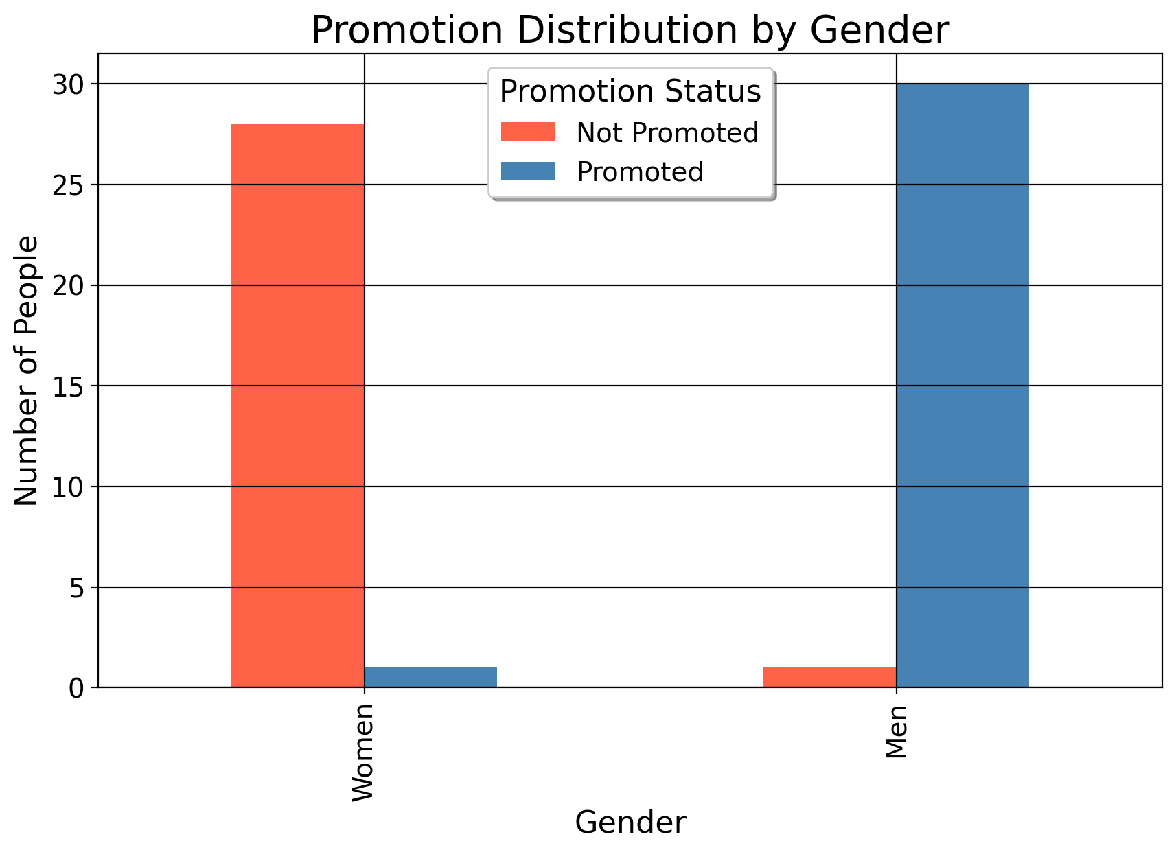
We can posit that gender may affect the likelihood of someone being promoted, perhaps men are more likely to be promoted than women. In this situation, we can graph the proportion of men who were promoted versus not. The plot above suggests that men were much more likely to be promoted than women are.
For those who care about the “statistical significance” of \(r\) …
As for mean differences, we can also use the t-statistic for the correlation coefficient to determine statistical significance. So let’s use the example above. First, here is the formula for the t-statistic:
\[ t = \frac{r \sqrt{n-2}}{\sqrt{1-r^2}} \]
where \(r\) is the Pearson correlation coefficient and \(n\) is the number of data points. Given:
\[ \begin{aligned} &r \approx 0.993 \\ &n = 4, \end{aligned} \]
we can begin by plugging in our values. First, we compute the variance in the denominator by squaring our \(r\):
\[ r^2 = 0.993^2 = 0.986049 \]
Then, we compute how much our one variable \(x\) does NOT explain the variance of the other variable:
\[ 1 - r^2 = 1 - 0.986049 = 0.013951 \]
For our numerator, we compute:
\[ \sqrt{n - 2} = \sqrt{4 - 2} = \sqrt{2} \approx 1.414 \]
Next, in the denominator, this simplifies to:
\[ \sqrt{1 - r^2} = \sqrt{0.013951} \approx 0.118 \]
Finally, we compute:
\[ t = \frac{0.993 \cdot 1.414}{0.118} \approx \frac{1.404102}{0.118} \approx 11.899 \]
Thus, the t-statistic for the given Pearson’s \(r\) is approximately \(\boxed{11.899}\). Since \(11.9>>1.96\), we’d say the linear association is statistically significant.
Important
You will never do this by hand (at least I never have!), I include this section only to show it’s possible.
6.1 A Prelude To Regression
Typically, when we discuss correlation, we use scatterplots to visualize the association between variables. A scatterplot is simply a chart which depicts the co-movement of variables. On the x-axis we plot our independent variables/predictors (or, the things we think explain a given outcome) and the y axis plots the variable we think is being affected by the one on the x-axis. Below, I plot in the left panel the homicide rate per 100,000 versus the state-specific Gini coefficient for 27 Brazilian states in the year 1990. The right panel plots the average retail price of cigarettes versus cigarette consumption per capita for 39 American states in the year 1980.
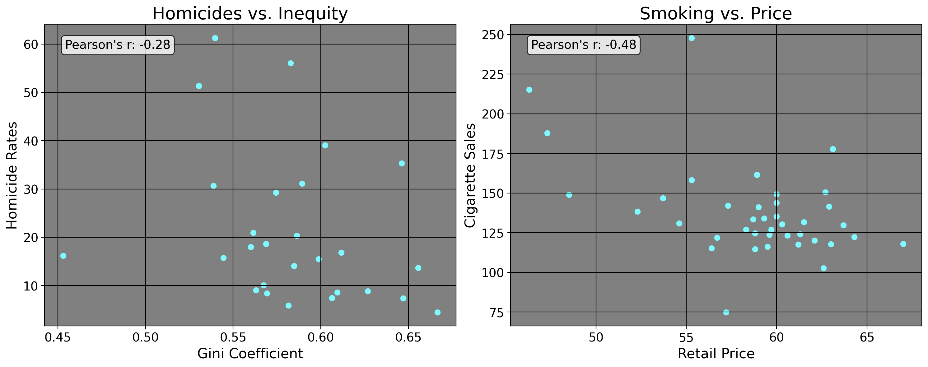
Well now, what do we see here? We see the plotted datapoints along with the Pearson’s \(r\). We can see a negative correlation coefficient reported, where a one unit increase in the Gini coefficient leads to a decrease in the homicide rate in Brazil for this year. We also observe a negative relationship between the retail price of cigarettes and the consumption of cigarettes, where an increase in price leads to a decrease in the amount of cigarettes consumed. This result especially should be pretty intuitive: all else equal, as the price of a good increases, the demand for said good generally decreases. However, what about the leftmost plot? The Gini coefficient is a measure for inequality, where 1 denotes one person has all the money and everyone else nada/nothing. A Gini coefficient of 0 means everyone has the same amount of money, and a measure of anything in between is some intermittent level of inequality. Well, this result is puzzling in a bivariate lens: typically, we associate income inequality and poverty with an increase in things like higher rates of homicide and other kinds of crime, but that’s not what this result implies. While correlation is a useful measure sometimes, it alone is inadequate for serious policy analysis. Below, I explain why.
6.2 The First Exercise of the Statistical Mind
Earlier this morning, I was on Facebook and one of my friends posted a picture that cited a story of a public school music teacher named Annie Ray winning a Grammy. In the article, they say [caps theirs]
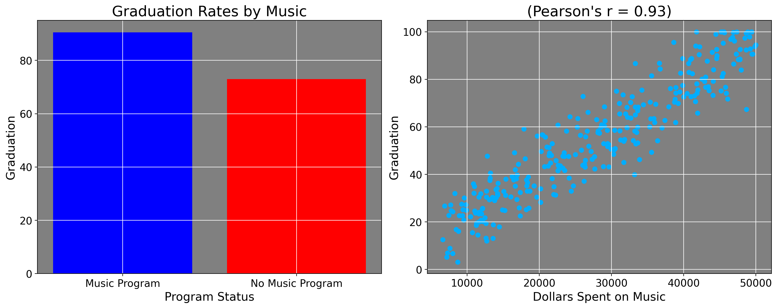
THE FACTS ABOUT THE IMPORTANCE OF MUSIC EDUCATION DON’T LIE… Schools that have music programs have significantly higher graduation rates than do those without music programs (90.2 percent as compared to 72.9 percent).
For visualization, let’s do some graphing shall we? The plot on the left plots the rates from the quote, the right plot is simulated data.
This quote caused fire alarms to sound in my head. Why? Because the article (and reporting on music education more broadly) misleadingly discusses these statistics. This does NOT mean these statistics are wrong in terms of their computation. Presumably whoever did this used statistical software to get these numbers, and I trust that the numbers are accurate.
My criticism is about practical implication. The heavy suggestion from the block quotation is the music programs are causing this 17.3 percentage point difference in graduation rates. When we read things like “The facts don’t lie”, there’s this air of certainty that these statistics are being reported with.
And in fairness, this is not a completely crazy idea: music does indeed help people learn languages. It likely helped me learn Spanish and made me a better overall reader. It’s also correlated with spatial skills. In fact, in another life, I was a music theorist who could do harmonic analysis of chord progressions and tell you what I thought the artist was trying to communicate. And as a matter of fact, music studies likely made me an even better econometrician, because one thing music analysis teaches you about is context. And in larger context, these statistics seem misleading.
The suggestion is that if more schools just had music programs, we’d see higher graduation rates by 17.3 percentage points, on average. And yes, to some degree, if a school now has a music program and did not have one before, it is true students now have the opportunity to learn music. They may even go on to study and succeed in music now that they have the opportunity to do so. But how could we estimate this? How many people would this even affect, exactly?
Most people do not want to be musicians. Learning music, like any other art form or professional skillset, is a non-trivial investment of time and money. Everyone doesn’t have the means or honestly dedication to pursue it, esepcially in light of other potential desires or opportunities. Those who do decide to become musicians (not just in classically trained in school, but generally) may have personal qualities that differ from other students in ways that affect whether they graduate or other aggregate metrics of success. So if 20 more students in a school of 5000 and a graduating class of 300 reap the benfits of music, is this really enough to move the proverbial needle on the graduation rate for an entire school or county? Not likely.
More to the point, not every school has the means to have a music program, nevermind a well funded music program. According to statistics reported by Yamaha, 8% of all public schools in the United States don’t have any arts programs at all (music, theatre, or dance).
In the U.S., schools are funded by property taxes in public schools and by extremely wealthy donors at private schools. This means that the wealthier public schools will be located in wealthier districts which naturally has a bigger tax base. What do those districts have more of? Money! Status, class, opportunity. Instruments do not grow on trees, they cost money; not every school has 80,000 dollars for a Steinway piano. By the way (no, I did not look this up before writing it), the same study, according to Yamaha’s reporting, said
The study also noted that a disproportionate number of these students without access to arts education are concentrated in major urban or very rural areas where the majority of students are Black, Hispanic or Native American, and at schools with the highest percentage of students eligible for free/reduced-price meals.
I have to emphasize again, I didn’t suspect this because I looked it up before, I suspected it because this is what it means to think like a statistician. It means you have to think in a multivariate way, where more than one thing can affect something else. Here, this idea is pretty obvious: how do we know that these graduation rates are not explained in part (if not entirely) by baseline differences in socioeconomic status of communities (poverty, low employment rates, larger contextual factors), opportunities of individual families (say, personal connections individual families may have that others don’t), as well as the effects those factors have on individual students? When we think of it like this, simply suggesting that music programs would be a great solution is not so convincing.
These aside, there may also be what we call “selection bias” here, where some students are able to select into/decide to go to a given school. For example, some schools have magnet programs. The one I was in was for the International Baccalaureate Program; other high schools have STEM magnet programs or music/arts programs where some schools literally recruit middle school students who want to pursue these things. And when they select for these qualities, it becomes hard to isolate the impact of a music program on a graduation rate, because they’re already selecting for highly motivated students (who mostly but not exclusively are from wealthier districts or better-to-do families). These are the kinds of students who would perform well anyways, even if music wasn’t there.
This again does not discount the real benefits of music education or the arts more generally! But when we read statistics, as with harmonic analysis of music chords, we also need to understand the context they exist within, and when we do this we begin to see that the relationship is not as clear cut as simple descriptive statistics might seem. As we see from the simulated plot, some schools have a graduation rate of almost nobody, which also happen to have low levels of music funding. And while I couldn’t find specific examples of this when I looked up data on it, numbers this low do happen anecdotally. And when we see numbers like this, we must ask ourselves “How are these sets of schools different from these sets of schools?”
As we will see when we cover regression analysis, the world rarely works off of pretty, linear functions. Measures of simple association do not mean that something is causing another thing, the world is much too complex for that. As researchers and as human beings, we must constantly be skeptical of simplistic claims and investigate them when they seem too good to be true.
With this exercise in mind, let’s think of a similar application of correlation in real life…
6.3 Correlation in Stata
Becuause you’ll never actuallly use the actual correlation coefficient for 99% of the analyses you ever do, I’ll only show how to use Stata to calculate correlation coefficients and scatterplots. Hopefully, the previous discussion is sufficient to show how it is not causation. Here, I take data from a paper that investigates the causal impact of crime reduction strategies on homicide rates (the same thing I did above). In 1999, the government of Sao Paulo “created or expanded a number of policies that have arguably contributed to the decrease in criminality”. One thing that may affect the homicide rate in a Brazilian state is the Gini Index, or a measure of inequality in a region. For the Gini Coefficient, -1 denotes perfect equality and 1 denotes one person having all of the money. We can produce a table and a plot in Stata which shows this relationship.
clear *

cls

//!!!!!!!!! Note my use of "import delimited",
// since this is the way to import a csv file

import delimited "https://raw.githubusercontent.com/danilofreire/homicides-sp-synth/master/data/df.csv", clear

keep if year == 1990

// restricting our sample size to 1990

keep code state year homiciderates giniimp

// keeping only these COLUMNS (the above keep, keeps only some observations)

corr homiciderates giniimp

twoway (scatter homiciderates giniimp, mcolor(pink) msymbol(smsquare)), ///
    ytitle(Homicide Rate) /// Y Axis Title
    xtitle(Gini Coefficient) /// X Axis Title
    title(Correlation Between Inequality and Homicide) /// Plot Title
    note(From: https://doi.org/10.25222/larr.334) ///
    scheme(sj) // Stata Journal Scheme
The table we get is
             | homici~s  giniimp
-------------+------------------
homicidera~s |   1.0000
     giniimp |  -0.2848   1.0000
The way to interpret this, is that there’s a weak negative relationship between the Gini Coefficient and the homicide rate. Or, as the Gini Coefficient/inequality increases, the homicide rate decreases
6.4 Implications
The reason this matters for policy analysts is because when taken to its conclusion, mistaken correlation for causation or not thinking about things in a systemic, multivariate way could result in pumping more money into music programs in order to fix failing schools, a much wider and more sophisticated problem.
It leads to things like pumping more money into police deparmtents to decrease crime rates, even though crime has been falling in general for decades in the U.S. and there’s no real link between militant policing measures and crime reduction.
It also leads to things like mass like many modern governemnts doing things like making dating apps and sponsoring mass dating events (yes, really!) in order to increase birth and marriage rates.
The idea of course is that people aren’t having kids or getting married because they’re not meeting one another. And if more people met, the more kids they’d have. And to a degree this is true due to things like social media, so the underlying logic makes plenty of sense. But then, once we agree to this probelm, we have to ask why are people not meeting one another and having kids or getting married? The real problem is a lot more systemic. Especially in South Korea, Japan, and China, the reasons are mostly having to do with labor issues, changes in gender norms, and broader social factors which lead to people not wanting to have kids.
7 Summary
Correlation and causation is a very delicate topic in statistics. Whenever we’re doing research, we must always be careful to structure our studies in such as way that our findings are not corrupted by other factors, even if our software tells us we’ve found a “statistically significant” correlation. I’m sure if we took the t-statistic of music programs and graudation (or funding of music programs, as my scatterplot does), we’d find a very high t-statistic for the correlation coefficient. Equally, we’d find a high t-statistic for countries reporting increases in loneliness and low fertility rates. But I don’t care, and neither should you, since there are other factors which contribute to graduation aside from music, and a lot more factors driving fertility rates than simple loneliness or lack of opportunity to meet people. Thinking causally can be a challenging thing. After multiple years of torment, you will learn to think like this as if by muscle memory since it’ll be so routine to you. We will cover this in more detail in our chapter on treatment effect estimation.